Chapter 9 Public Speaking
9.8 Presentation Aids
 Why should you use presentation aids? If you have prepared and rehearsed your speech adequately, shouldn’t a good speech with a good delivery be enough to stand on its own? While it is true that impressive presentation aids will not rescue a poor speech, it is also important to recognize that a good speech can often be made even better by the strategic use of presentation aids. Presentation aids can fulfill several functions: they can serve to improve your audience’s understanding of the information you are conveying, enhance audience memory and retention of the message, add variety and interest to your speech, and enhance your credibility as a speaker. Let’s examine each of these functions.
Improving Audience Understanding
Human communication is a complex process that often leads to misunderstandings. If you are like most people, you can easily remember incidents when you misunderstood a message or when someone else misunderstood what you said to them. Misunderstandings happen in public speaking just as they do in everyday conversations.
One reason for misunderstandings is the fact that perception and interpretation are highly complex individual processes. Most of us have seen the image in which, depending on your perception, you see either the outline of a vase or the facial profiles of two people facing each other. This shows how interpretations can differ, and it means that your presentations must be based on careful thought and preparation to maximize the likelihood that your listeners will understand your presentations as you intend them to.
As a speaker, one of your basic goals is to help your audience understand your message. To reduce misunderstanding, presentation aids can be used to clarify or to emphasize.
Clarifying
Clarification is important in a speech because if some of the information you convey is unclear, your listeners will come away puzzled or possibly even misled. Presentation aids can help clarify a message if the information is complex or if the point being made is a visual one.
If your speech is about the impact of the Coriolis effect on tropical storms, for instance, you will have great difficulty clarifying it without a diagram because the process is a complex one. The diagram in Figure 15.1 “Coriolis Effect” would be effective because it shows the audience the interaction between equatorial wind patterns and wind patterns moving in other directions. The diagram allows the audience to process the information in two ways: through your verbal explanation and through the visual elements of the diagram.
Figure 15.2 “Model of Communication” is another example of a diagram that maps out the process of human communication. In this image you clearly have a speaker and an audience (albeit slightly abstract), with the labels of source, channel, message, receivers, and feedback to illustrate the basic linear model of human communication.
Figure 15.1 Coriolis Effect
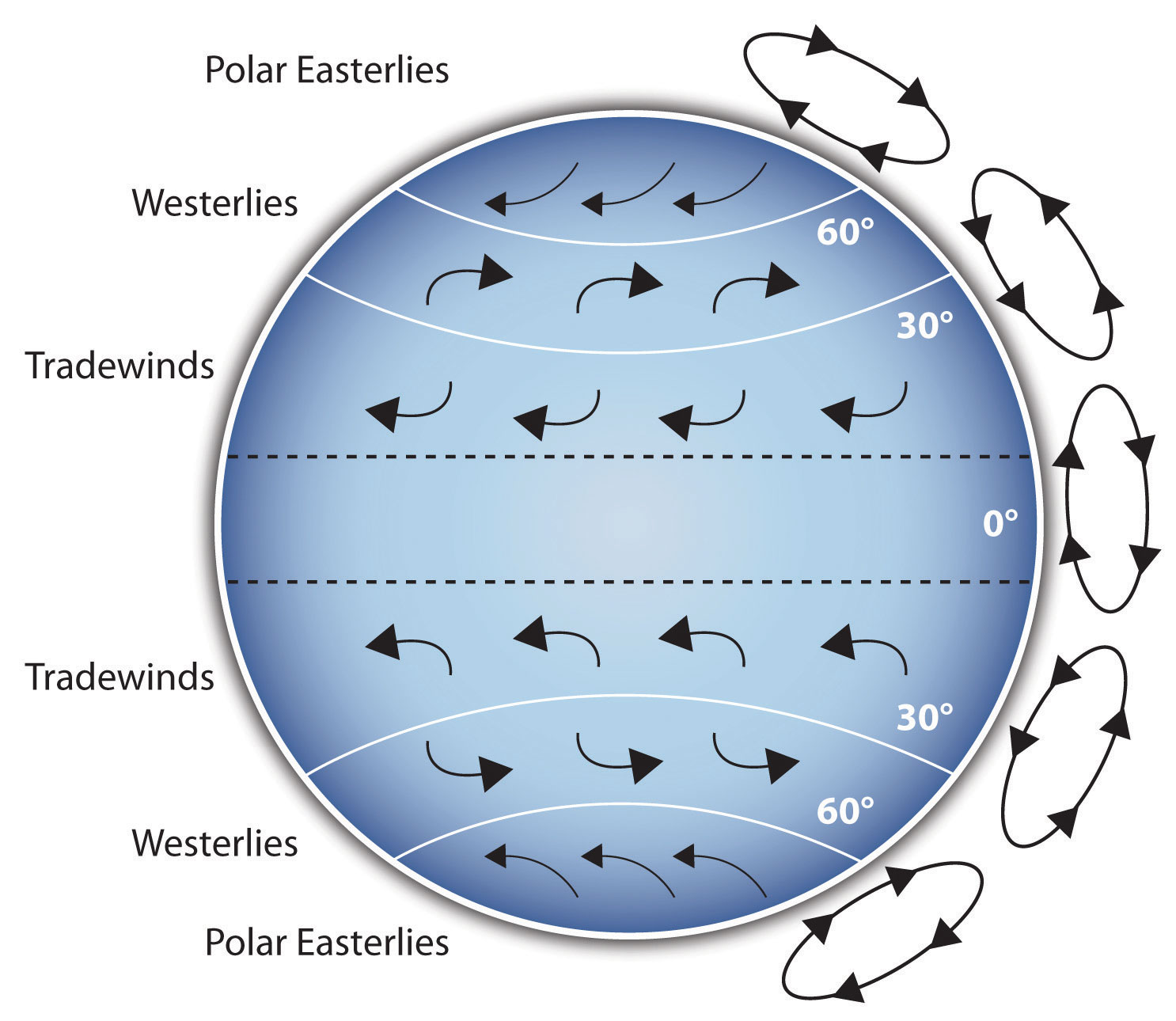
Figure 15.2 Model of Communication
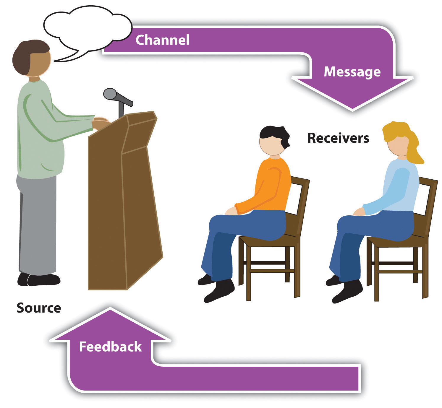
Figure 15.3 Petroglyph

Another aspect of clarifying occurs when a speaker wants to visually help audience members understand a visual concept. For example, if a speaker is talking about the importance of petroglyphs in Native American culture, just describing the petroglyphs won’t completely help your audience to visualize what they look like. Instead, showing an example of a petroglyph, as in Figure 15.3 “Petroglyph”, can more easily help your audience form a clear mental image of your intended meaning.
Emphasizing
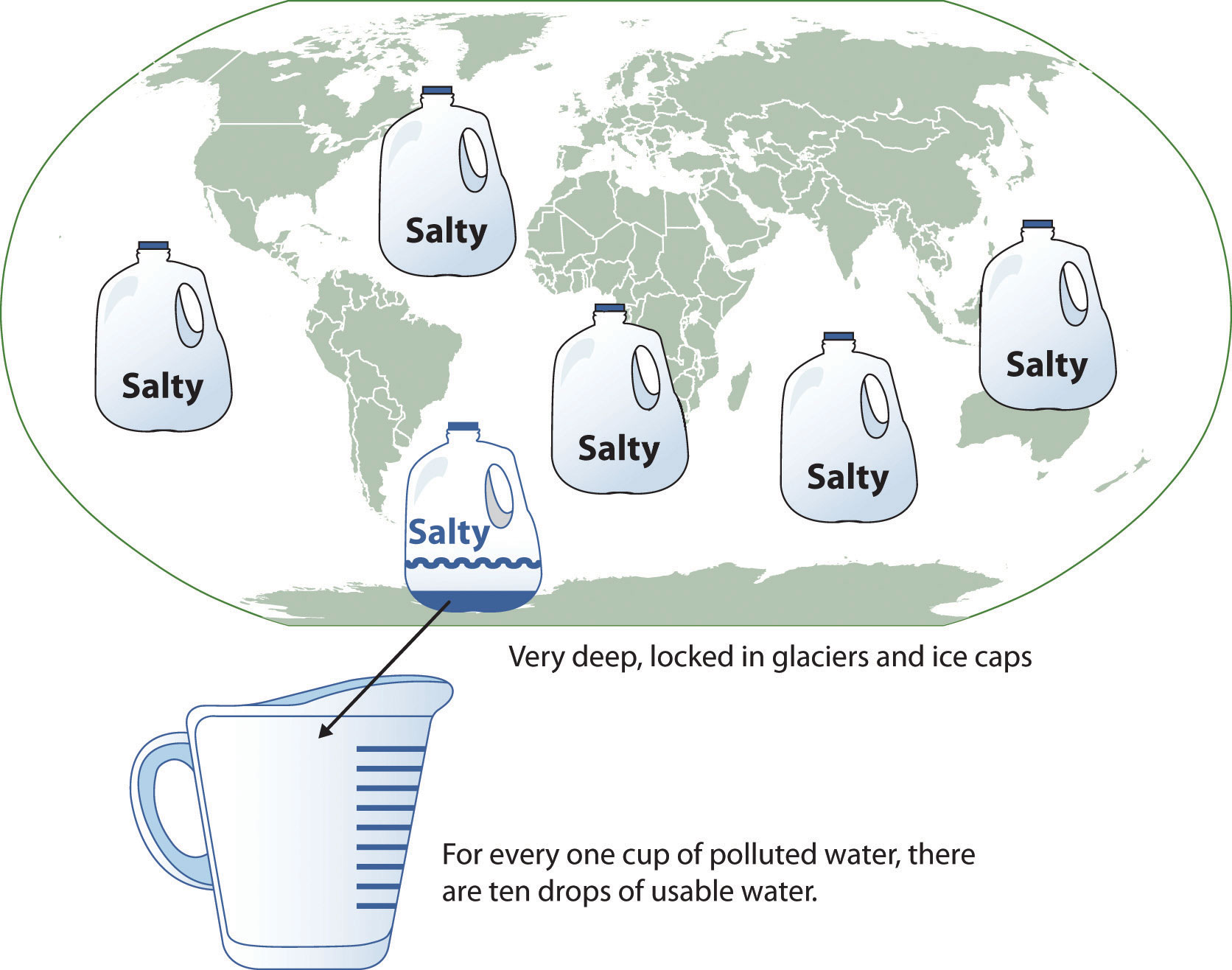
When you use a presentational aid for emphasis, you impress your listeners with the importance of an idea. In a speech on water conservation, you might try to show the environmental proportions of the resource. When you use a conceptual drawing like the one in Figure 15.4 “Planetary Water Supply”, you show that if the world water supply were equal to ten gallons, only ten drops would be available and potable for human or household consumption. This drawing is effective because it emphasizes the scarcity of useful water and thus draws attention to this important information in your speech.
Figure 15.4 Planetary Water Supply

Another way of emphasizing that can be done visually is to zoom in on a specific aspect of interest within your speech. In Figure 15.5 “Chinese Lettering Amplified”, we see a visual aid used in a speech on the importance of various parts of Chinese characters. On the left side of the visual aid, we see how the characters all fit together, with an emphasized version of a single character on the right.
Aiding Retention and Recall
The second function that presentation aids can serve is to increase the audience’s chances of remembering your speech. A 1996 article by the US Department of Labor summarized research on how people learn and remember. The authors found that “83% of human learning occurs visually, and the remaining 17% through the other senses—11% through hearing, 3.5% through smell, 1% through taste, and 1.5% through touch” (United States Department of Labor, 1996). Most of how people learn is through seeing things, so the visual component of learning is very important. The article goes on to note that information stored in long-term memory is also affected by how we originally learn the material. In a study of memory, learners were asked to recall information after a three day period. The researchers found that they retained 10 percent of what they heard from an oral presentation, 35 percent from a visual presentation, and 65 percent from a visual and oral presentation (Lockard & Sidowski, 1961). It’s amazing to see how the combined effect of both the visual and oral components can contribute to long-term memory.
For this reason, exposure to a visual image can serve as a memory aid to your listeners. When your graphic images deliver information effectively and when your listeners understand them clearly, audience members are likely to remember your message long after your speech is over.
Moreover, people often are able to remember information that is presented in sequential steps more easily than if that information is presented in an unorganized pattern. When you use a presentation aid to display the organization of your speech, you will help your listeners to observe, follow, and remember the sequence of information you conveyed to them. This is why some instructors display a lecture outline for their students to follow during class.
An added plus of using presentation aids is that they can boost your memory while you are speaking. Using your presentation aids while you rehearse your speech will familiarize you with the association between a given place in your speech and the presentation aid that accompanies that material. For example, if you are giving an informative speech about diamonds, you might plan to display a sequence of slides illustrating the most popular diamond shapes: brilliant, marquise, emerald, and so on. As you finish describing one shape and advance to the next slide, seeing the next diamond shape will help you remember the information about it that you are going to deliver.
Adding Variety and Interest
A third function of presentation aids is simply to make your speech more interesting. While it is true that a good speech and a well-rehearsed delivery will already include variety in several aspects of the presentation, in many cases, a speech can be made even more interesting by the use of well-chosen presentation aids.
For example, you may have prepared a very good speech to inform a group of gardeners about several new varieties of roses suitable for growing in your local area. Although your listeners will undoubtedly understand and remember your message very well without any presentation aids, wouldn’t your speech have greater impact if you accompanied your remarks with a picture of each rose? You can imagine that your audience would be even more enthralled if you had the ability to display an actual flower of each variety in a bud vase.
Similarly, if you were speaking to a group of gourmet cooks about Indian spices, you might want to provide tiny samples of spices that they could smell and taste during your speech. Taste researcher Linda Bartoshuk has given presentations in which audience members receive small pieces of fruit and are asked to taste them at certain points during the speech (Association for Psychological Science, 2011).
Enhancing a Speaker’s Credibility
Presentation aids alone will not be enough to create a professional image. As we mentioned earlier, impressive presentation aids will not rescue a poor speech. However, even if you give a good speech, you run the risk of appearing unprofessional if your presentation aids are poorly executed. This means that in addition to containing important information, your presentation aids must be clear, clean, uncluttered, organized, and large enough for the audience to see and interpret correctly. Misspellings and poorly designed presentation aids can damage your credibility as a speaker. Conversely, a high quality presentation will contribute to your professional image. In addition, make sure that you give proper credit to the source of any presentation aids that you take from other sources. Using a statistical chart or a map without proper credit will detract from your credibility, just as using a quotation in your speech without credit would.
If you focus your efforts on producing presentation aids that contribute effectively to your meaning, that look professional, and that are handled well, your audience will most likely appreciate your efforts and pay close attention to your message. That attention will help them learn or understand your topic in a new way and will thus help the audience see you as a knowledgeable, competent, credible speaker.
Types of Presentation Aids
There are several types of presentation aids, and each has its strengths in terms of the type of information it lends itself to presenting. It’s important to remember that supporting materials presented on presentation aids should be properly cited. While visual aids can help bring your supporting material to life, they can also add more opportunities for things to go wrong during your speech. Therefore we’ll discuss some tips for effective creation and delivery as we discuss the various types of presentation aids.
Presentation Software
The prevalence of computers and projectors in most schools, offices, and other presentation facilities has made using computer-generated visual aids more convenient. PowerPoint is the most commonly used presentation software and has functionality ranging from the most simple text-based slide to complicated transitions, timing features, video/sound embedding, and even functionality with audience response systems like Turning Point that allow data to be collected live from audience members and incorporated quickly into the slideshow. Despite the fact that most college students have viewed and created numerous PowerPoint presentations, I have still seen many poorly executed slideshows that detracted from the speaker’s message. PowerPoint should be viewed as a speech amplifier. Like an amplifier for a guitar, it doesn’t do much without a musician there to play the instrument. The speaker is the musician, the speech is the instrument, and PowerPoint is the amplifier. Just as the amplifier doesn’t dictate what the guitar player does, neither should PowerPoint take over the speaker.
Creating Quality Slide Shows
Slides should show the principles of good design, which include unity, emphasis or focal point, scale and proportion, balance, and rhythm (Lauer & Pentak, 2000). Presenters should also pay attention to tone and usability. With those principles in mind, here are some tips for creating and then using presentation software.
Unity and Consistency
Generally it is best to use a single font for the text on your visuals so that they look like a unified set. Or you can use two different fonts in consistent ways, such as having all headings and titles in the same font and all bullet points in the same font. Additionally, the background should remain consistent, whether you choose one of the many design templates or if you just opt for a background color.
In terms of unity, the adage, “Keep It Simple, Speaker” definitely applies to presentation slides. Each slide should have one message, one photo, one graphic. The audience members should know what they are supposed to look at on the slide. A phrase to remember about presentation slides and the wide range of design elements available is “Just because you can, doesn’t mean you should.”
Another area related to unity and consistency, as well as audience response, is the use of animation or movement. There are three types of animation in slideshows. First, you can embed little characters or icons that have movement. These may seem like fun, but they have limited use and should not stay on the screen very long—you can use the second type of animation to take them off the screen.
That second type is the designed movement of text or objects on and off the screen. Although using this function takes up time in preparing your slides, especially if you want to do it well and be creative with it, it is very useful. You can control what your audience is seeing. It also avoids bringing up all the text and material on a slide at one time, which tempts the audience again to pay more attention to the screen than to you. Movement on the screen attracts attention, for better or worse. PowerPoint, for example, allows bouncing words, pulsating text, swirling phrases, even Star Wars scroll, which may or may not serve your purpose.
The third type of animation is called slide transitions, which is the design of how the next slide appears. In PowerPoint you can have the slides appear automatically or as blinds, as little checkerboards, from different sides of the screen, in opening circles, etc. (You can also use sound effects, but that is strongly discouraged.) In Prezi, the slides transition by zooming in and out, which is a clever effect but does make some audience members experience motion sickness. In general, you want to use a consistent and efficient pattern of movement with the second and third types of animation.
Emphasis, Focal Point, and Visibility
Several points should be made about how to make sure the audience sees what they need to see on the slides.
1. It is essential to make sure the information is large enough for the audience to see; and since the display size may vary according to the projector you are using, this is another reason for practicing in advance with the equipment you intend to use.
2. A standard rule is for text is 6 X 4. Have no more then 6 horizontal lines (this does not mean bullet points, but lines of text, including the heading) and the longest line should not exceed 4 – 5 words.
3. Avoid too many slides. Less sometimes really is more. Again, there is no hard and fast rule, but a ten-minute speech probably needs fewer than ten slides, unless you can make a good argument for more based on the content of the speech. If, however, the slides are just text, more than ten is too many.
4. Do not assume that all the templates feature visible text. Text should not be smaller than 22 point font for best visibility, and some of the templates use much smaller fonts than 22 point. This is especially important in those situations where the speaker creates handouts. Text smaller than 22 is very difficult to see on handouts of your slides. (However, handouts are not recommended for most situations.)
5. High contrast between the text and slides is extremely important. White fonts against very dark backgrounds and black fonts against very light backgrounds are probably your safest bet here. Remember that the way it looks on your computer screen is not the exactly how it will look when projected—the light is coming from a different place. Avoid words on photos. Figure 9.21 shows a photo with the words placed across the center of the image. Not only does this obviously obscure some of the picture, it also makes the words difficult to read. Figure 9.22, by contrast, has the accompanying text placed just blow the image, making both much easier to see, and a citation is provided.
Garamond. Merriam-Webster (2018) defines “serif” as “any of the short lines stemming from and at an angle to the upper and lower ends of the strokes of a letter.” Serifs are additions to the letters on different fonts that give them a different appearance and help the flow of eye when reading.
Tone
Fonts, color, clip art, photographs, and templates all contribute to tone, which is the attitude being conveyed in the slides. If you want a light tone, such as for a speech about cruises, some colors (springtime, pastel, cool, warm, or primary colors) and fonts (such as Comic Sans) and lots of photographs will be more appropriate. For a speech about the Holocaust, more somber colors and design elements would be more fitting, whereas clip art would not be.
Scale and Proportion
Although there are several ways to think about scale and proportion, we will discuss three here. First, bullet points. Bullet points infer that the items in the bulleted list are equal and the sequence doesn’t matter. If you want to communicate order or sequence or priority, use numbers. Do not mix outline points or numerical points with bullet points. Also, you should not put your outline (Roman numerals, etc.) on the slide.
Bullet points should be short—not long, full sentences—but at the same time should be long enough to mean something. In a speech on spaying and neutering pets, the bullet point “pain” may be better replaced with “Pet feels little pain.” Second, when you are designing your slides, it is best to choose a template and stick with it. If you input all your graphics and material and then change the template, the format of the slide will change, in some cases dramatically, and you will have distorted graphics and words covered up. You will then have to redesign each slide, which can be unnecessarily time-consuming.
The third aspect of scale and proportion is the relationship between the graphics and text in terms of size. This aspect is discussed below in the next section on “Balance.” Also, a graphic should be surrounded by some empty space and not just take up the whole slide.
Balance
In general you want symmetrical slides. Below are four examples of slides that are unbalanced, and a fifth that achieves a better symmetry and design.
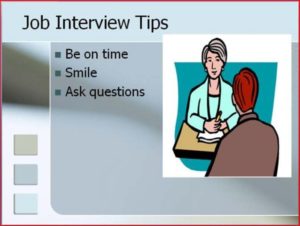
Block of Text: This sl ide does not break the text up into bullets and is therefore hard to read; the graphic is strangely small, and the heading is in a different font. Script fonts are often hard to read on screens.
 Unbalanced: This slide leaves too much ‘white space” below the text, leaving an imbalance between the text and graphic; the graphic goes up into the title, and the title is not centered.
 Busy: This slide is far too “busy.” The additional clip art is not helpful, the font is too small, and the ideas are disconnected. Having text in all caps is also difficult to read.

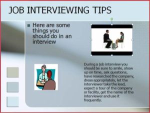
Better: This version provides more visual balance and has minimal words per bullet. A photograph would probably have work better than clip art on this slide. It also has a few typos—can you find them?
Summary: Tips for Using Presentation Slideshows
- Do not have more than two slides per main point.
- Use a consistent theme with limited variation in font style and font size.
- Incorporate text and relevant graphics into each slide.
- Limit content to no more than 4ish words per line and 4-6 bullet points per slide.
- Use key words, not complete sentences; be concise.
- Avoid unnecessary animation or distracting slide transitions.
“Getting Plugged In”
Alternatives to PowerPoint
Although PowerPoint is the most frequently used presentation software, there are alternatives that can also be engaging and effective if the speaker is willing to invest the time in learning something new. Keynote is Apple’s alternative to Microsoft’s PowerPoint and offers some themes and style choices that can set your presentation apart from the familiar look of PowerPoint. Keep in mind that you will need to make sure you have access to Mac-compatible presentation tools, since Keynote won’t run or open on most PCs. Prezi is a new web-based presentation tool that uses Flash animation, zooming, and motion to make a very different-looking computer-generated visual aid. If you have the time to play with Prezi and create a visual aid for your presentation, you will stand out. You can see Prezi in action in Note 9.31 “Video Clip 9.1”. You can also see sample presentations on Prezi’s website.
- What are some positives and negatives of using PowerPoint as a visual aid?
- What are some other alternatives to using PowerPoint as a visual aid? Why?
Video Clip 9.1
In this video, James Geary presents on metaphor using Prezi as his visual aid.
Whiteboards and Flip Charts
Whiteboards and flip charts can be useful for interactive speeches. If you are polling the audience or brainstorming you can write down audience responses easily for everyone to see and for later reference. They can also be helpful for unexpected clarification. If audience members look confused, you can take a moment to expand on a point or concept using the board or flip chart. Since many people are uncomfortable writing on these things due to handwriting or spelling issues, it’s good to anticipate things that you may have to expand on and have prepared extra visual aids or slides that you can include if needed. You can also have audience members write things on boards or flip charts themselves, which helps get them engaged and takes some of the pressure off you as a speaker.
Tips for Using Whiteboards & Flip Chars Effectively
- Make sure your handwriting is legible
- Remember then when you write on these objects, you turn your back to your audience and break eye contact. Thus, use sparingly.
- Dont fill them up with a lot of information before your speech. You dont want your audience reading them while they should be listening to you.
Objects
Three-dimensional objects that represent an idea can be useful as a visual aid for a speech. They offer the audience a direct, concrete way to understand what you are saying. I often have my students do an introductory speech where they bring in three objects that represent their past, present, and future. Students have brought in a drawer from a chest that they were small enough to sleep in as a baby, a package of Ramen noodles to represent their life as a college student, and a stethoscope or other object to represent their career goals, among other things. Models also fall into this category, as they are scaled versions of objects that may be too big (the International Space Station) or too small (a molecule) to actually show to your audience.
Tips for Using Objects Effectively
- Make sure your objects are large enough for the audience to see.
- Do not pass objects around, as it will be distracting.
- Hold your objects up long enough for the audience to see them.
- Do not talk to your object, wiggle or wave it around, tap on it, or obstruct the audience’s view of your face with it.
- Practice with your objects so your delivery will be fluent and there won’t be any surprises.
Posters and Handouts

Posters generally include text and graphics and often summarize an entire presentation or select main points. Posters are frequently used to present original research, as they can be broken down into the various steps to show how a process worked. Posters can be useful if you are going to have audience members circulating around the room before or after your presentation, so they can take the time to review the poster and ask questions. Posters are not often good visual aids during a speech, because it’s difficult to make the text and graphics large enough for a room full of people to adequately see. The best posters are those created using computer software and professionally printed on large laminated paper.
These professional posters come at a price, often costing between forty and sixty dollars. If you opt to make your own poster, take care to make it look professional. Use a computer and printer to print out your text; do not handwrite on a poster. Make sure anything you cut by hand has neat, uniform edges. You can then affix the text, photos, and any accent backing to the poster board. Double-sided tape works well for this, as it doesn’t leave humps like those left by rolled tape or the bubbles, smearing, or sticky mess left by glue.
Handouts can be a useful alternative to posters. Think of them as miniposters that audience members can reference and take with them. Audience members will likely appreciate a handout that is limited to one page, is neatly laid out, and includes the speaker’s contact information. It can be appropriate to give handouts to an audience before a long presentation where note taking is expected, complicated information is presented, or the audience will be tested on or have to respond to the information presented. In most regular speeches less than fifteen minutes long, it would not be wise to distribute handouts ahead of time, as they will distract the audience from the speaker. It’s better to distribute the handouts after your speech or at the end of the program if there are others speaking after you.
Pictures, Diagrams and Drawings
Photographs, paintings, drawings, and sketches fall into the pictures category of visual aids. Pictures can be useful when you need to show an exact replication of what you’re speaking about. Pictures can also connect to your audience on a personal level, especially if they evoke audience emotions. Think about the use of pictures in television commercials asking for donations or sponsorships. Organizations like Save the Children and the American Society for the Prevention of Cruelty to Animals successfully use pictures of malnourished children or abused animals to pull at the heartstrings of viewers. A series of well-chosen and themed pictures can have a meaningful impact on an audience. Although some pictures can be effectively presented when printed out on standard 8 1/2″ x 11″ printer paper using a black and white printer, others will need to be enlarged and/or printed in color, which will cost some money. You can often avoid this by incorporating a picture into a PowerPoint presentation, as the picture will be projected large enough for people to see. We will discuss PowerPoint in more detail later.
Diagrams are good for showing the inner workings of an object or pointing out the most important or relevant parts of something. Think about diagrams as blueprints that show the inside of something—for example, key bones in the human body in a speech about common skateboarding injuries. Diagrams are good alternatives to pictures when you only need to point out certain things that may be difficult to see in a photograph.
You may even be able to draw a simple diagram yourself if you find it would be useful during your speech. Although not all maps are simple enough to be created by the speaker, many maps can be hand drawn during a speech or ahead of time to indicate different locations or patterns. While I would recommend that you anticipate this ahead of time so you can incorporate a more professional version of the diagram created with computer software or more precise drawing, drawing a diagram on an overhead projector, whiteboard, or smart board can be useful.
Charts and Tables
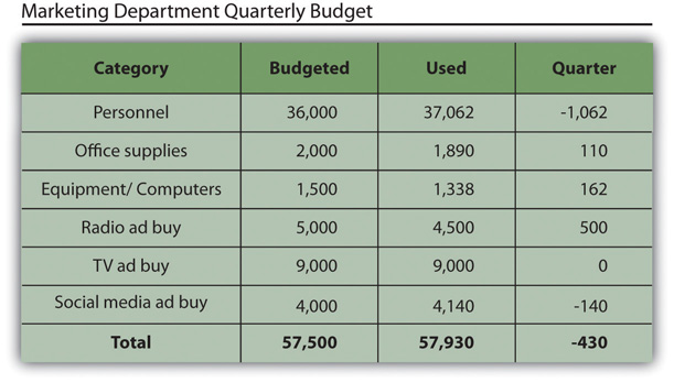
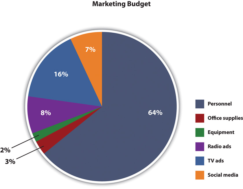
Charts and tables are useful for compiling and cross-referencing larger amounts of information. The combination of rows and columns allows you to create headers and then divide them up into units, categories, dates, and so on. Medical information is put into charts so that periods of recorded information, such as vital signs, can be updated and scanned by doctors and nurses. Charts and tables are also good for combining text and numbers, and they are easy to make with word processing software like Microsoft Word or spreadsheet software like Excel. Think of presenting your department’s budget and spending at the end of a business quarter. You could have headers in the columns with the various categories and itemized deductions in the rows ending with a final total for each column.
A pie chart is an alternative representation of textual and numerical data that offers audience members a visual representation of the relative proportions of a whole. In a pie chart, each piece of the pie corresponds to a percentage of the whole, and the size of the pie varies with the size of the percentage. As with other charts and tables, most office software programs now easily make pie charts.
Graphs
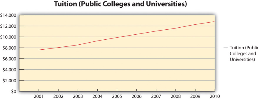
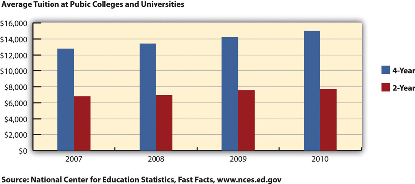
Graphs are representations that point out numerical relationships or trends and include line graphs and bar graphs. Line graphs are useful for showing trends over time. For example, you could track the rising cost of tuition for colleges and universities in a persuasive speech about the need for more merit-based financial aid.
Bar graphs are good for comparing amounts. In the same speech, you could compare the tuition of two-year institutions to that of four-year institutions. Graphs help make numerical data more digestible for your audience and allow you to convey an important numerical trend visually and quickly without having to go into lengthy explanations. Remember to always clearly label your x-axis and y-axis and to explain the basics of your graph to your audience before you go into the specific data. If you use a graph that was created by someone else, make sure it is large and clear enough for the audience to read and that you cite the original source.
Video
Video clips as visual aids can be powerful and engaging for an audience, but they can also be troublesome for speakers. Whether embedded in a PowerPoint presentation, accessed through YouTube, or played from a laptop or DVD player, video clips are notorious for tripping up speakers. They require more than one piece of electronics when they are hooked to a projector and speaker and sometimes also require an Internet connection. The more electronic connection points, the more chances for something to go wrong. Therefore it is very important to test your technology before your speech, have a backup method of delivery if possible, and be prepared to go on without the video if all else fails. Although sometimes tempting, you should not let the video take over your speech. I recommend that my students not have more than 10 percent of their speech be filled with video, meaning there should be no more than one minute of video in a ten-minute speech. Make sure your video is relevant and that it is cued to where it needs to be. One useful strategy for incorporating video is to play a video without audio and speak along with the video, acting as a narrator. This allows the speaker to have more control over the visual aid and to adapt it and make it more relevant to a specific topic and audience. Additionally, video editing software like Final Cut and iMovie are readily available to college students and relatively easy to use. Some simple editing to cut together various clips that are meaningful or adding an introductory title or transitions can go a long way toward making your video look professional.
Summary
Visual aids play an important role in conveying supporting material to your audience. They also tie to delivery, since using visual aids during a speech usually requires some physical movements. It is important not to let your use of visual aids detract from your credibility. I’ve seen many good speeches derailed by posters that fall over, videos with no sound, and uncooperative PowerPoint presentations.
The following tips can help you ensure that your visual aids enhance, rather than detract, from your message and credibility:
- Only have your visual aid displayed when it is relevant to what you are saying.
- Make sure to practice with your visual aids so there aren’t any surprises on speech day.
- Don’t read from your visual aids. Put key information (e.g., 1-4 words per bullet) from your PowerPoint or Prezi on your speaking outline and only briefly glance at the screen to make sure you are on the right slide. You can also write information on the back of a poster or picture that you’re going to display so you can reference it while holding the visual aid up, since it’s difficult to hold a poster or picture and note cards at the same time.
- Triple check your technology to make sure it’s working: electricity, Internet connection, wireless clicker, sound, and so on.
- Proofread all your visual aids to find spelling/grammar errors and typos.
- Bring all the materials you may need to make your visual aid work: tape/tacks for posters and pictures, computer cables/adaptors, and so on. Don’t assume these materials will be provided.
- Have a backup plan in case your visual aid doesn’t work properly
