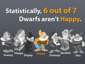
7
Using Statistics in Your Speech Can
- Increase your credibility. Using credible research in interesting ways will increase your credibility.
- Make your speech memorable. Effectively used statistics can give the audience something to think about long after the speech is over. Let me share with you a couple of examples from my experience. More than ten years ago, I had a student hand each of us a folded piece of paper. At a set time during his speech, he had us stand if we had an X on our paper. I stood and looked around at four others who were standing. We were then asked to open our paper and read it aloud. Mine said “chlamydia.” He went on to tell us for a class the size of ours, statistics suggest at least five of us had a sexually transmitted infection.
I also have a very vivid memory of a student who talked about the number of sex offenders who become repeat offenders. Throughout her presentation, she showed the mugshots of men serving a second term for sex offenses. Beside the first mugshot: 24% of rapists who get out will rape again. Beside another mugshot: 16% who molest girls will get out and molest again. Beside another mugshot–35% who molest young boys get out and molest again. I can still see those faces and statistics in my mind’s eye.
- Emotionally impact your audience. A properly applied statistic can make us feel something. For example, Telling your audience that according to UNESCO many children do not get to go to school is one thing, sharing with them that in sub-Saharan Africa, one in five children between the ages of six and eleven are not in school. In addition, of those youth ages 15-16, 60% are not in school. To really impact the listeners, a speaker might include a picture of a child. To help students apply the statistic, they might say, “Consider if over half of your high school class was denied access to school.
- Illuminate a subject. Statistics can help to shine a light on a problem. Scottish poet, Andrew Lang, said, “Most people use statistics like a drunk man uses a lamppost; more for support than illumination.” The good news is you don’t have to choose, you can use your statistic to both shine a light and support your argument. A student of mine attended a Passion Conference where Louie Giglio gave a speech that shined a spotlight on the 27 million human slaves who are trapped because of human trafficking. As a result of that speech, over three million dollars was raised and my student came back to Fayetteville, Arkansas, and started a campaign at the University of Arkansas to highlight the issue of modern-day slavery.
Tips for Using Numbers in Speech
Round large numbers off
Instead of saying the US national debt is 27,887,185,810,245, say 28 trillion. Better yet, help the audience understand by saying the US national debt is 28 billion– that represents is $84,000 per citizen and $222,000 per taxpayer. Round statistics to make them easier to remember. Better yet, help the audience apply them. For example, instead of just saying “more than a quarter (25%) of all traffic-related deaths are the direct result of alcohol impairment, you might say, “One in four.”
Help your audience visualize numbers by using comparisons
You can say Nik Wallenda walked the 1,400 feet on a wire over the Grand Canyon, but you can help us to understand it by adding a comparison, “He walked 1400 feet– that is the length of four football fields–on a wire.”
In 1961, Micky Mantel sent the ball flying 643 feet for the longest home run. To put it in perspective that is 1,257-dollar bills laid end to end.
One speech teacher said her student carried in a 50-pound bag of dog food and sat it on the table and then said, “This used to be me before I lost weight. I no longer carry this bag around with me everywhere I go.”
We humans are a smart bunch,
but we really suck when it comes to understanding
and handling excessively large numbers.
George Dvorsky, Writer and bioethicist
Check Out These Examples
of Visualizing Large Numbers
IT DOESN’T LINE UP WHEN PRINTED
-
“To put a trillion dollars in context, if you spend a million dollars every day since Jesus was born, you still wouldn’t have spent a trillion.” Mitch McConnell
- Bill Gates has 56 billion dollars. He has earned over $3000 per minute ($50/second) since Microsoft was created. For perspective, Azad says, For Bill Gates, “spending 5 seconds to pick $100 off the floor is literally not a good use of his time.”
- “The Mariana Trench reaches to a maximum depth of 36,000 feet, that’s tough to make sense of. It’s much easier for our brains to understand that as 6.8 miles (11 km), which is a distance we already have a pretty good intuition for.” Spencer Greenberg
- “If you go hang gliding, you have a roughly 1 in 116,000 chance of being killed during that flight. Is that a lot of risk? It’s very tough to tell. But here’s another way to think about it. If you’re a 30-year-old male in the U.S., you have about a 1 in 260,000 chance of dying tomorrow. So that means that tomorrow, by going hang gliding once, you’re taking on 3.2 times more risk than you usually do in a given day! So that gives a new way of thinking about hang gliding risk if you’re a 30-year-old male in the United States: You’re tripling your usual risk of death for each such flight you take.” Mathematician Spencer Greenberg.
- “So, let’s take a figure like $400,000,000 dollars — which happens to be Powerball’s next jackpot amount. How much money is that, really? That’s tough to make sense of but if you live for 60 more years, that’s 525,600 hours remaining in your life, so if you win that jackpot — not taking into account time/value discounting and inflation considerations — that’s like getting paid $761 per hour for each hour in the rest of your life (including when you’re asleep).” Mathematician Spencer Greenberg.
- “San Francisco’s metro area has about 4.3 million people. How many is that? Well, if you spoke to each person for one minute, and you did that eight hours a day, it would take you 24.5 years to speak to them all.” George Dorsky
- What does it mean to think about 400,000 people? One thing I like to do is break it down into something I’m familiar with and that I can kind of visualize: the crowd attending a sporting event. For example, hockey arenas seat about 20,000 people. So, you could envision 400,000 people as 20 hockey arenas worth of people.” George Dorsky
- Historian Gwynne Dyer compared the carnage of combined casualties between 72,000 and 73,000 at Borodino to “a fully-loaded 747 crashing, with no survivors, every 5 minutes for eight hours.”
Spread numbers throughout your speech
It is tempting to have the “numbers section” of your speech, it is much better to spread them out. If we hear too many numbers all at once, we stop paying attention. Help us to process the number by giving us time to think in between them.
Set up the statistic
Give verbal cues that what we are about to hear is important.
- I am going to give you a number, that will surprise you.
- Let me tell you about this interesting statistic I heard.
- This number may shock you as much as it does me.
- I was surprised to learn that…
Say the numbers clearly and with emphasis (Bullet Points are different than above)
- Speak slower when saying numbers
- Repeat the number when necessary
- Pause before saying the number to give the audience time to prepare to listen
- Pause after saying a number to let it sink in
Repeat important numbers
According to the National Center for Education Statistics, one in five use adults has low literacy skills. The survey defines literate as those who have the ability to the ability to “understand, evaluate, use and engage with written texts to participate in society, to achieve one’s goals, and to develop one’s knowledge and potential.”
If you are like me, you read the information, but it didn’t fully sink in. Now, consider the impact of that statistic when you repeat it:
According to the National Center for Education Statistics, one in five use adults has low literacy skills. One in five… let that sink in for a moment. That’s one in five adults who struggle to read a newspaper, a job application, a medical form. That’s one in five adults who lack the ability to achieve their goals and potential. That’s one in five adults who can’t read the voting form. That’s one in five adults who lack the ability to read things that would allow them to engage in society.
Literacy is defined as the ability to “understand, evaluate, use and engage with written texts to participate in society, to achieve one’s goals, and to develop one’s knowledge and potential” and one in five adults in the US, cannot do that.
Pair the number with a story
When you pair your number with a powerful graphic or story, it becomes even more moving.
When I think of the low literacy rate, I think of a man I know. He was the high school football star who was pushed through school so he could play on the team. He graduated with a letterman’s jacket and fame as a hometown hero. He graduated a star, a star who was unable to read. At eighteen years old, he was handed a diploma and sent out into the world unable to read a job application, unable to read a medical form at the doctor’s office, and unable to read his son a story before bed. When I think of one in five adults, I think of him and, all of a sudden, it is more than a number.
Tell them why it is important
Don’t just tell a story about your statistic, tell why it matters.
The illiterate football star went on to have four children of his own. When his daughter needed help with her reading, dad couldn’t help. When the children did learn to read, they would read for dad. They would read his mail, his paperwork, his government documents.
Statistics shouldn’t just hang there, they should be emphasized, make relatable, and applies. Speech coach Nancy Duarte reminds us that a number alone doesn’t mean anything– “Data slides aren’t really about the data. They’re about the meaning of the data. It’s up to you to make that meaning clear before you click away. Otherwise, the audience won’t process — let alone buy — your argument.”
Activate their other senses
Numbers will not cause us to see, hear, feel, or sense movement unless, the speaker helps us.
Take for example this classroom activity created by National Geographic as a resource for teachers to help students understand the distances of the planets. They encourage teachers to take students outside and count their steps as they mark the distance of the planets.
- Sun: stands at the edge of the area
- Mercury = 1 step from the sun
- Venus = 2 steps from the sun
- Earth = 2.5 steps from the sun
- Mars = 4 steps from the sun
- Jupiter = 13 steps from the sun
- Neptune = 76 steps from sun
You might not have your audience go outside (this is a speech, after all), but you could take steps along the stage to help them “see” and imagine. You could have a volunteer take the steps, or you could put up a picture of each planet one at a time and ask the audience to imagine walking to that planet. Why the emphasis on walking? Because even the act of imagining walking a distance activates the movement part of the brain. The more parts of the brain you can get involved in, the more memorable the concept.
Use charts to persuade your audience
In this D-News video, they tell you about what research says about the best way to convince someone they are wrong. Watch here:
Use Charts to Highlight the Content
Four Principles for Making a Memorable and Effective Pie Chart
- Make your pie chart as large as possible.
- Go for high contrast colors.
- Put the numbers on the chart as opposed to using a key.
- Have a clear title explaining the purpose of the chart (optional).
I learn best by example, so let me show you and not just tell. Watch how these speakers used their charts.
Watch how Tim Urban creatively uses charts at the beginning to make a big point.
Watch the first three minutes of this speech and how Alice Goffman brilliantly uses a graph. This video has to be watched on the TED YouTube channel.
He references his Tedpad in the speech, here is the link so you can see more for yourselves go to Tedpad.
I invited a professional colleague of mine to advise you on making data slides. I’ll let him tell you how to make data slides that captivate.
Data and Slides: Confuse Your Audience or Captivate Them?
Your Choice
by Robert “Bob” Kienzle
As a corporate communication consultant, I help bank and insurance employees improve their presentation skills and one of the top requests I get is to help financial analysts present their research, data and slides clearly. The problem I am most often called up on to fix: data-heavy presentations. I typically see three major problems:
- Data dumps: Presentations that are 90% information, content, data, and research.
- Speaker or slides: Presentations that rely on slides for delivering ideas, and the slides ultimately make the presenters obsolete.
- Vexing visuals: Graphs and charts overflowing with numbers, lines, and text, making it hard to read and even harder to follow.
I tell my clients that it is easy to avoid these presentation errors by following three suggestions.
Suggestion #1: Analyze your audience and speak to their experience.
No matter what field you are in, stop showing your audiences how smart you are. Give them the information they will be able to understand and use in their jobs. This might mean making different versions of your core presentation for different audiences. Be sure to leave out technical language and jargon for non-experts. If the audience will need to look up the term or ask someone what it means, use a simpler word, or define the tech lingo right from the start.
Think about a financial researcher who knows all the numbers backward and forwards. When they create a chart for their fellow researchers, there are 10 rows and 10 columns of information with small charts and numbers. Their chart covers 5 years of data. Their fellow researchers have seen similar charts and data before: they can follow one column to the next because the patterns of information make sense. Now consider what happens when that chart is brought into the marketing department. The slides become the focus of the presentation instead of the presenter. The marketers try to read and figure out what all the data means. They don’t know the history of this data. They don’t use complex charts of financial research. They don’t know which sets of data to look at and, more importantly, they don’t care. They think, “What’s the takeaway the marketing team needs?” The financial researcher could easily make a simpler chart with 3 rows and columns. The researcher could show the overall trends of the last 5 years, not the details of each year. If the marketing team needs more detail, they can easily ask for more.
Suggestion #2: Use examples, stories, and easy-to-imagine explanations with your data.
Do you know what humans aren’t good at? Making sense of raw data. Remembering standalone facts. Visualizing statistics in their head.
Our brains don’t think in large numbers, especially when large numbers are first presented. Most of us have never physically been in a room with 1 billion US dollars. Even seeing the number written out as 1,000,000,000 takes people a moment to count the zeros and think, “ah, 1 billion, not 1 million.” Most of us have never had that many zeros in our personal bank accounts (if you have, I have some investment proposals I’d love to share with you)! Heck, my iPhone’s calculator only goes up to 100,000,000. So when we present large numbers, whether it’s dollars, people, or trees, why do we think these large statistics will make sense to our audience?
Give the audience some familiar examples and comparisons to make sense of large numbers.
- Example 1: “1,000,000,000 dollars is what it would cost 25,000 Arkansans to get a 4-year degree from the University of Arkansas with in-state tuition and fees.”
- Example 2: “1,000,000,000 people is the population of Arkansas 333 times over, or 3 times the entire US population. That’s like 11,018 Fayettevilles.”
- Example 3: “The US government wants to plant 1 billion trees. A line of 1 billion trees spaced 10 feet apart would stretch 18,939 miles or 76% of the way around the Earth’s equator.”
Storytelling is another great way to make sense of your data. In data-heavy presentations, tell a story. Audiences don’t visualize or remember numbers very well, but they do visualize and remember stories. Tell us the time period, the characters, the plot, and what happened, and along the way, drop in your statistics to serve as details.
Suggestion #3: Use headlines, highlights, and the most appropriate chart or graph.
There’s a fundamental rule about how audiences obtain information: humans rely on their eyes more than other senses. If you give them something to read, they will read it. If you give them something to read while you are talking at the same time, not only are they going to focus on reading and stop paying attention to the words coming out of your mouth, you are going to overload their short-term memory with too much stimuli. This stops long-term memories from being formed, and that’s why many business presentations (and one might argue college lectures) are forgotten.
Let me give you three recommendations on creating data slides, charts, graphs, and tables that will impact your audience.
- Use headlines to start each slide with your key message and help the audience make sense of the data. Take a look at this slide and try to guess the speaker’s key message:
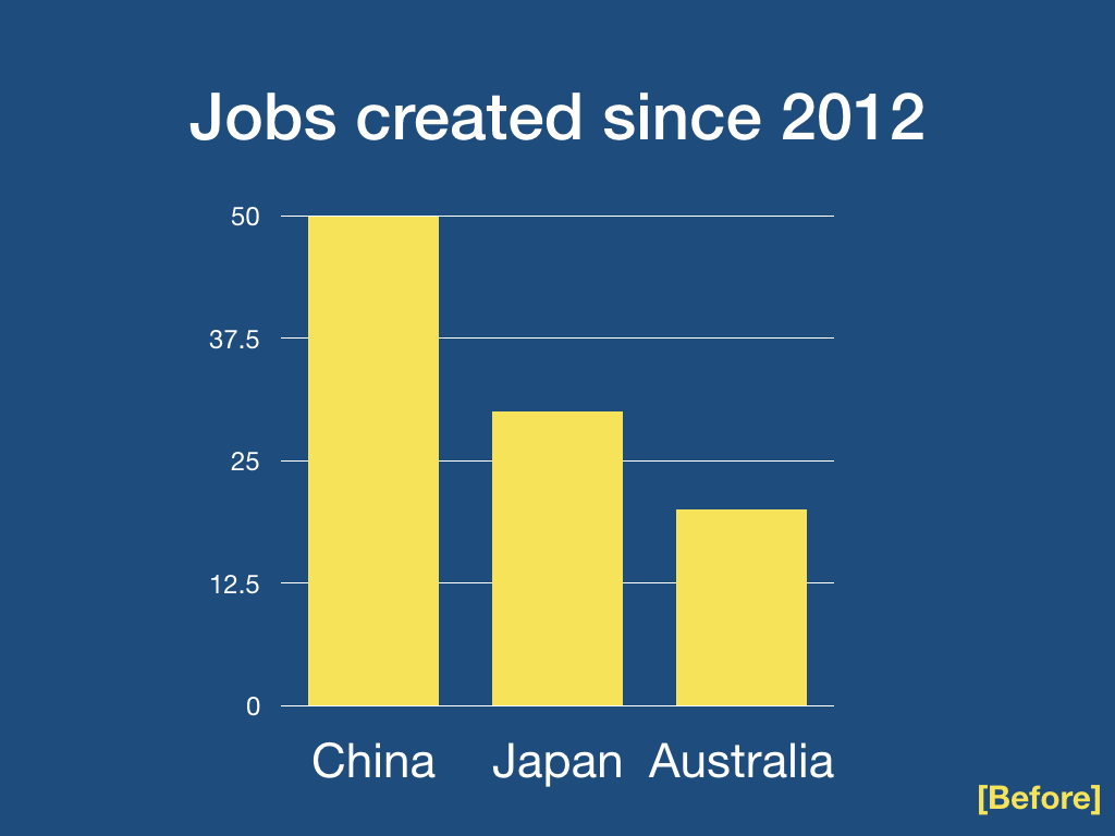
You have to analyze the data and numbers for yourself. Isn’t it the speaker’s job to tell you what’s important? Additionally, there may be information missing. Are those 50 jobs created in China or 50% of jobs? Is the speaker focused on the high number of jobs created in China, or are they focused on the fewer jobs created in Australia? I guess I’ll have to wait for the speaker to tell me.
Take a look at the slide with a headline:
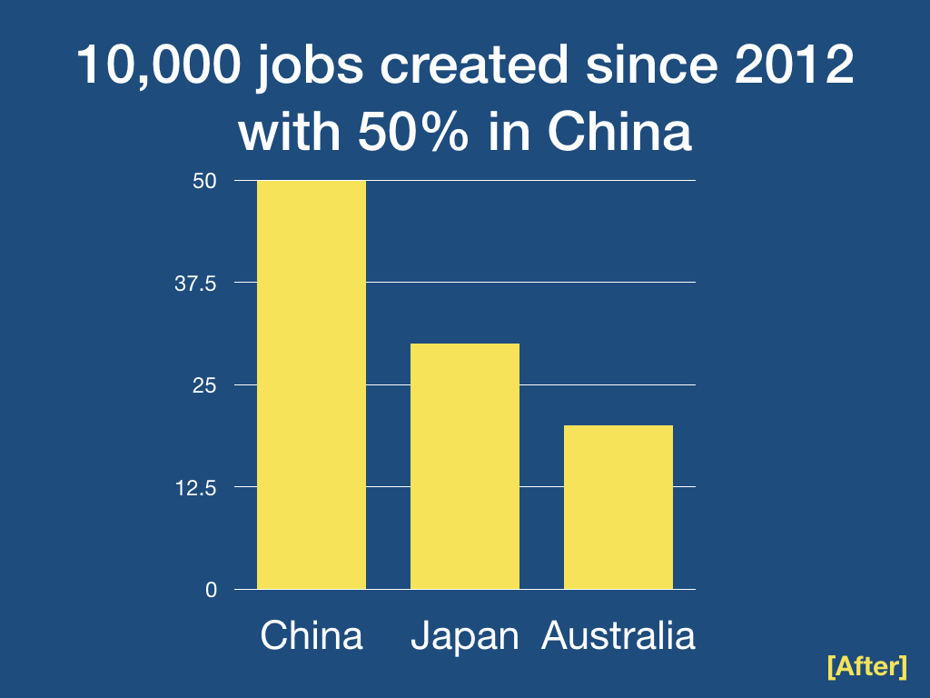
Now the audience gets the key message right away even before the speaker has to say anything (or after they have explained their message and they want to back it up with visuals). Once we read the headline, the rest of the data makes sense, and we can spend time listening to the speaker instead of interpreting the data for ourselves.
- Use highlights to show what’s important and to direct the audience’s eyes and attention. Look at this graph again:

Imagine the speaker wants to talk about the jobs in China first: what kind of jobs were created, which cities in China they were in, and how the jobs were performing. The problem is that audiences love to use their eyes, so they may drift over to the Japan section and think, “I wonder if the jobs in Japan are in Tokyo or Osaka.”
The speaker can use highlights like making a bar in red like this to control the focus on China:
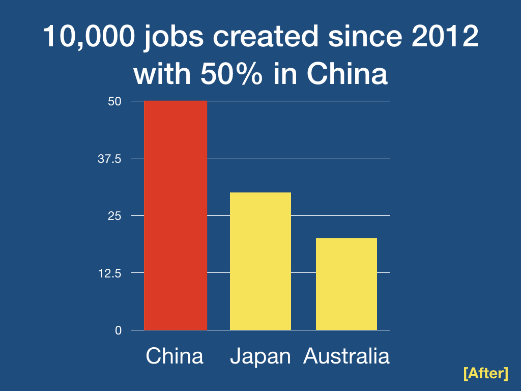
When the speaker moves from China to Japan, the highlight can change with their transition.
- Choose the right type of chart or graph for your data. Bar graphs, line graphs, pie charts, spider charts, box and whisker plots…the list of options goes on. While the dozens of choices can be overwhelming, there are resources to help you choose what works best for your data and your purpose.
In closing, if all these suggestions make sense, that’s awesome. Your next step is to start using them. Try one suggestion and see how your presentation and visuals improve. Once you’re comfortable with the improvement, use another. The ultimate goal isn’t simply clarity and understanding in your data presentations; the goal is getting the job offer, getting your boss to approve your new project, or getting your client to sign a contract. Being relatable and understandable especially with data makes you a great communicator, and people love working with great communicators.
Key Takeaways
Remember This!
- Effectively using, charts, data, and statistics can increase credibility, emotionally impact your audience, and make your speech memorable.
- Help the audience relate to numbers by rounding off large numbers, using comparisons, and pairing the number with a story.
- Spread statistics throughout your speech, set up the statistic, and repeat important numbers.
- Always tell the audience why the statistic is important.
- When using charts, make them large and easy to read.
References
Azad, K. (n.d.) How to develop a sense of scale. Better explained: Learn right not rote. https://betterexplained.com/articles/how-to-develop-a-sense-of-scale/
CDC. Sexually Transmitted Diseases. Data from the CDC. https://www.cdc.gov/std/statistics/default.htm
Covington, T. (2021). Drunk driving statistics. https://www.thezebra.com/resources/research/drunk-driving-statistics/.
Crime Victims Center, Statistics-Offenders. https://www.parentsformeganslaw.org/statistics-offenders/
DNews: (2014). How to convince someone they are wrong. https://youtu.be/sJ64h49gSwY
Dvorsky, G. (2014). How to understand incomprehensibly large numbers. https://io9.gizmodo.com/how-to-comprehend-incomprehensibly-large-numbers-1531604757
Dyer, G. (1988). War. Crown Publishing.
Duarte, N. (2019). Datestory: Explain date and inspire action through story. Ideapress Publishing.
Duarte, N. (2013). When presenting your date, get to the point fast. Harvard Business Review. https://hbr.org/2013/03/when-presenting-your-data-get.
Duarte, N. (2008). Slideology: The art and science of creating great presentations. Oreilly.
End it Movement. https://enditmovement.com/about/
Goffman, A. How we’re priming some kids for college—and others for prison. [Video]. YouTube. https://www.ted.com/talks/alice_goffman_how_we_re_priming_some_kids_for_college_ and_others_for_prison?language=en
Google News. Cases of COVID worldwide. https://news.google.com/covid19/map?hl=en-US&gl=US&ceid=US%3Aen
Grasping Large Numbers. (2015). The endowment to human growth. https://www.ehd.org/science_technology_largenumbers.php
Kienzle, B. (2020). Data and slides: Confuse your audience or captivate them? Your choice. Custom essay written for this text.
King, D. (2013). Six tips for using numbers in a speech. Kings Corners. http://donnellking.com/blog/2013/06/six-tips-for-using-numbers-in-a-speech/
The Mick. (n.d.). Mickey Mantle set the record for the longest home run of 643 feet in 1961.
http://www.themick.com/anniv06.htm
Mikaberidze, A. (2007). The battle of Borodino: Napolean against Kutuzov. Pen and Sword.
National Geographic. (n.d). Planetary size and distance comparison. https://www.nationalgeographic.org/activity/planetary-size-and-distance-comparison/
National Center for Education Statistics. (2019). Adult literacy in the United States. https://nces.ed.gov/datapoints/2019179.asp
Reynolds, G. (2008). Presentationzen. New Riders.
Romans, C. (2009). Numb and number: Is trillion the new billion? CNN. http://edition.cnn.com/2009/LIVING/02/04/trillion.dollars/
Truth in Accounting. (n.d.). Our Debt Clock https://www.truthinaccounting.org/about/our_national_debt?gclid=CjwKCAiA65iBBhB-EiwAW253W0c-SP83hbLCqB55eSq-jTvbqjhtZobz_SIKrygtTyvO2vUXCAoMfBoCtgEQAvD_BwE
Unesco Institue for Statistics. Education in Africa. http://uis.unesco.org/en/topic/education-africa
Urban, T. (2016). Inside the mind of a master procrastinator. [Video] YouTube. https://www.youtube.com/watch?v=arj7oStGLkU
U.S. Debt Clock.org. https://www.usdebtclock.org/#
Wernicke, S. (2010). Lies, damned lies, and statistics (about TEDTalks). [Video] YouTube.https://youtu.be/1Totz8aa2Gg
